Designing with Salt Figma Libraries
Salt provides a comprehensive set of components and styles, which include themes, typography, color palettes, iconography and more. Use the components as they are, out of the box, or adapt them to suit the needs of your business or application.
Start Your Migration
New Salt DS Figma libraries are live! Plan your migration now to ensure a seamless transition before the existing libraries are unpublished. We’re here to help!
When can you expect this change?
- New libraries published: January 6th, 2025
- Existing libraries retired: Immediately after release
- Existing libraries unpublished
- Light/ Dark Figma Libraries (non-variable based, UITK themed): February 28th
- Salt (Next) Libraries (variable based, Brand themed): May 2nd
For more details, read our Migration Guide. Have questions? Visit our support page or contact us.
To start designing with Salt, you should:
- Have an active Figma account.
- To use the Salt typography style, install the Open Sans, PT Mono, and Amplitude fonts. If you don't already have them, you can download Open Sans and PT Mono from Google Fonts. If you are a JPMC employee, you can download the Amplitude font from Self Service.
Watch our tutorial video on setting up Salt DS Figma libraries for your project. (JPMC Employees Only)
We maintain a comprehensive set of up-to-date libraries in Figma, to help you make beautiful, consistently designed UIs and applications. If you want to start using Salt Design System for your project, first you need to set up the Salt libraries on your Figma.
To start using the Salt libraries, enable them directly from the “Assets” panel within your Figma file.
To start using the Salt libraries, search for the @jpmorgan_salt handle in the Figma Community.
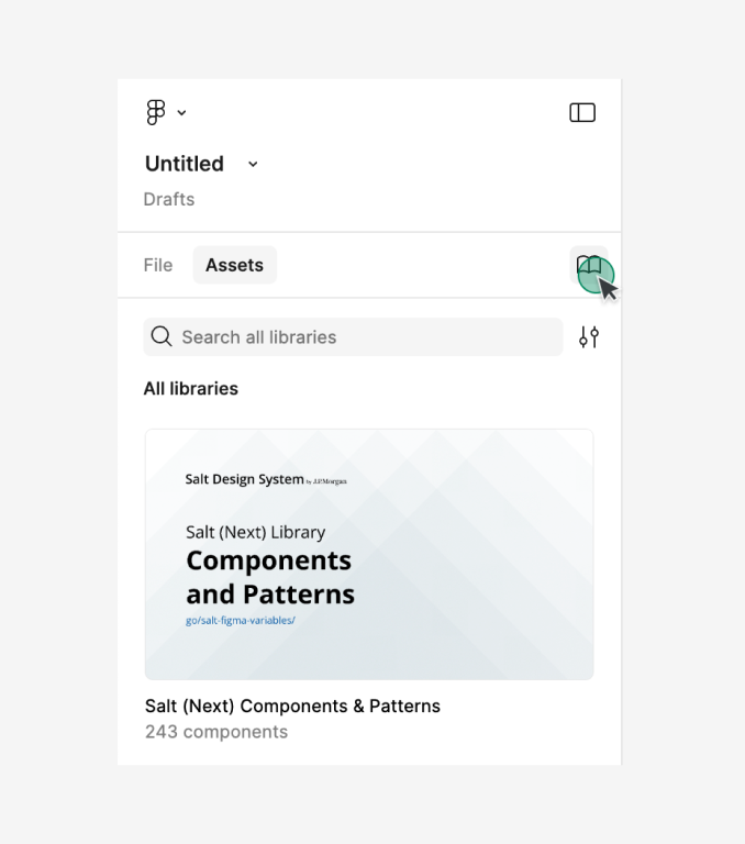
1. Start by opening a new design file in Figma. You’ll notice some pre-installed libraries in the assets panel. Click on the library icon located in the assets panel to manage your libraries.
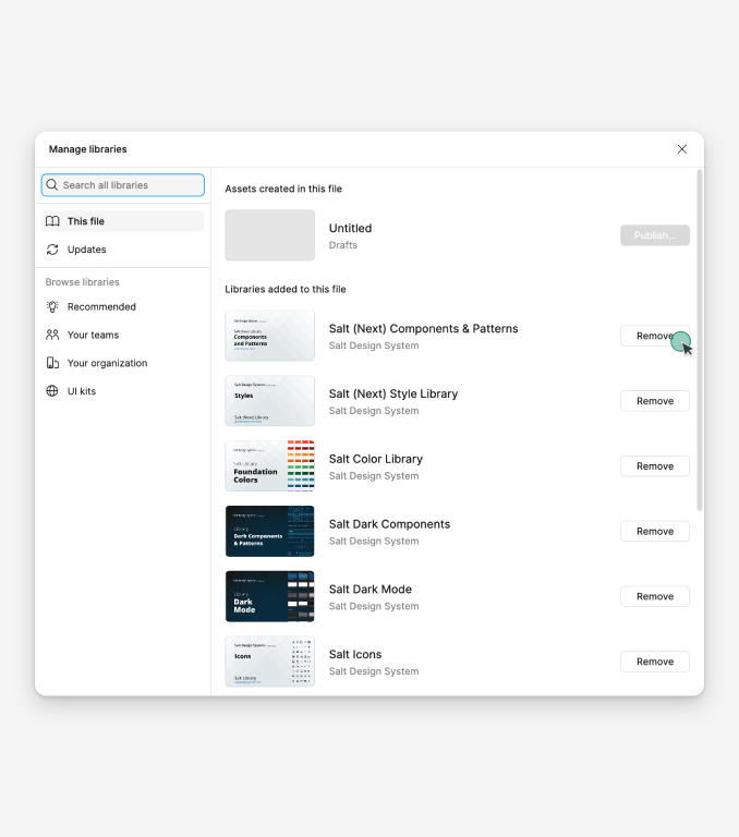
2. Identify any libraries you don’t need and click the “Remove” button on the right side to declutter your workspace.
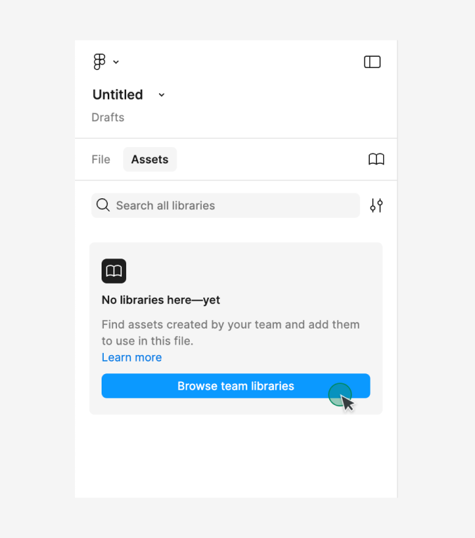
3. Once your workspace is clean, click the “Browse team libraries” button to search for and install new libraries.
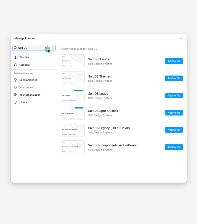
4. In the search field, type “Salt DS” to see the Salt DS libraries.
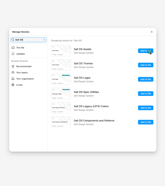
5. Click the “Add to file” button to include a Salt DS library in your design file. For details on each library, see the section below.
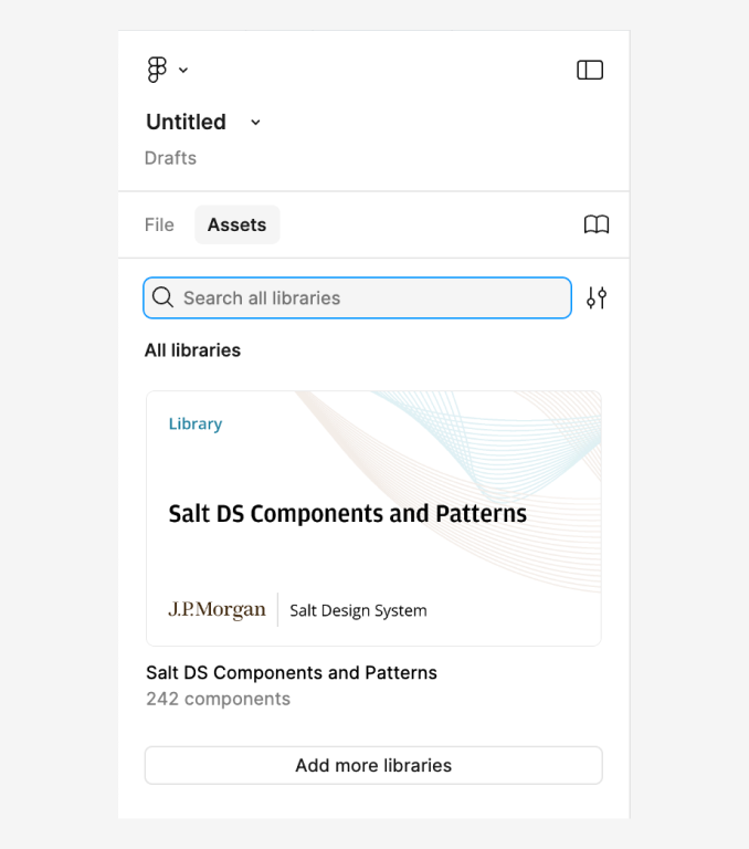
6. Now, you will be able to see the available Salt DS libraries in the assets panel. You can start using it in your design projects.
Salt offers six libraries in Figma. Install the library that best suits your needs.
| Library | Description |
|---|---|
| Salt DS Components and Patterns | This library includes all Salt DS components and patterns that are represented in code and are documented on the site. To use Salt components and patterns directly, please install this library. |
| Salt DS Themes | This library includes all typography and effect styles as well as all color, size, and spacing variables needed for the themes available within the components and patterns library. All variables are reflective of the design tokens in code. |
| Salt DS Assets | This library offers Salt icons and country symbols. |
| Salt DS JPM Brand Colors | This library provides variables for each foundational color needed for the Salt DS JPM Brand theme. |
| Salt DS Legacy (UITK) Colors | This library provides variables for each foundational color needed for the Salt DS Legacy (UITK) theme. |
| Salt DS Logos | This library contains logo variations, including J.P. Morgan, Chase, and dual brand logos. This library is for internal JPMC use only. |
If you are migrating from other libraries, including Salt (Next), Salt Light, Dark libraries, and UITK, please refer to our migration guide (JPMC employees only).
This table shows the definitions of different Salt design assets in Figma:
| Figma mechanisms | Salt Code equivalent: Component or Pattern | Definition |
|---|---|---|
| Figma Component | Salt Component | A Figma component that shouldn’t be detached and is configured by props, kept as close as possible to the coded component. May contain ‘swap’ elements for additional composability. |
| Figma 'Template' Component | Salt Component and Salt Pattern | A Figma component that comprises of nested components and is designed to be detached for further reuse. Basic configuration props enable you to define and configure the best starting point before detaching. |
| Figma Sticker | Salt Component and Salt Pattern | Figma examples built by Salt or App teams with Salt DS. Provided as frames, not components, that can be copied and pasted from our Sticker sheet file into your projects as a starter. |
If you encounter any issues or need additional help despite following the guide, please don’t hesitate to reach out. Our support team is here to assist you.